KOBE STORKS Japan pro basketball team rebranding by GWG Inc. (Japan)
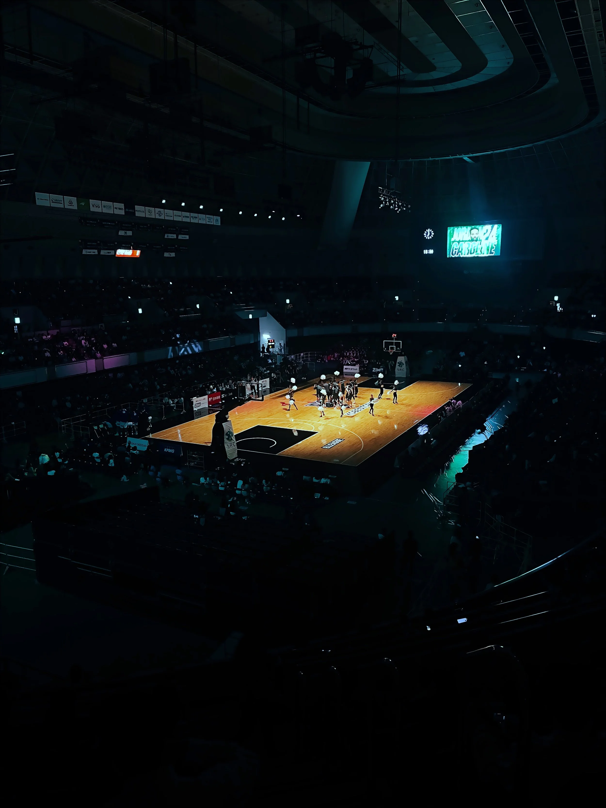
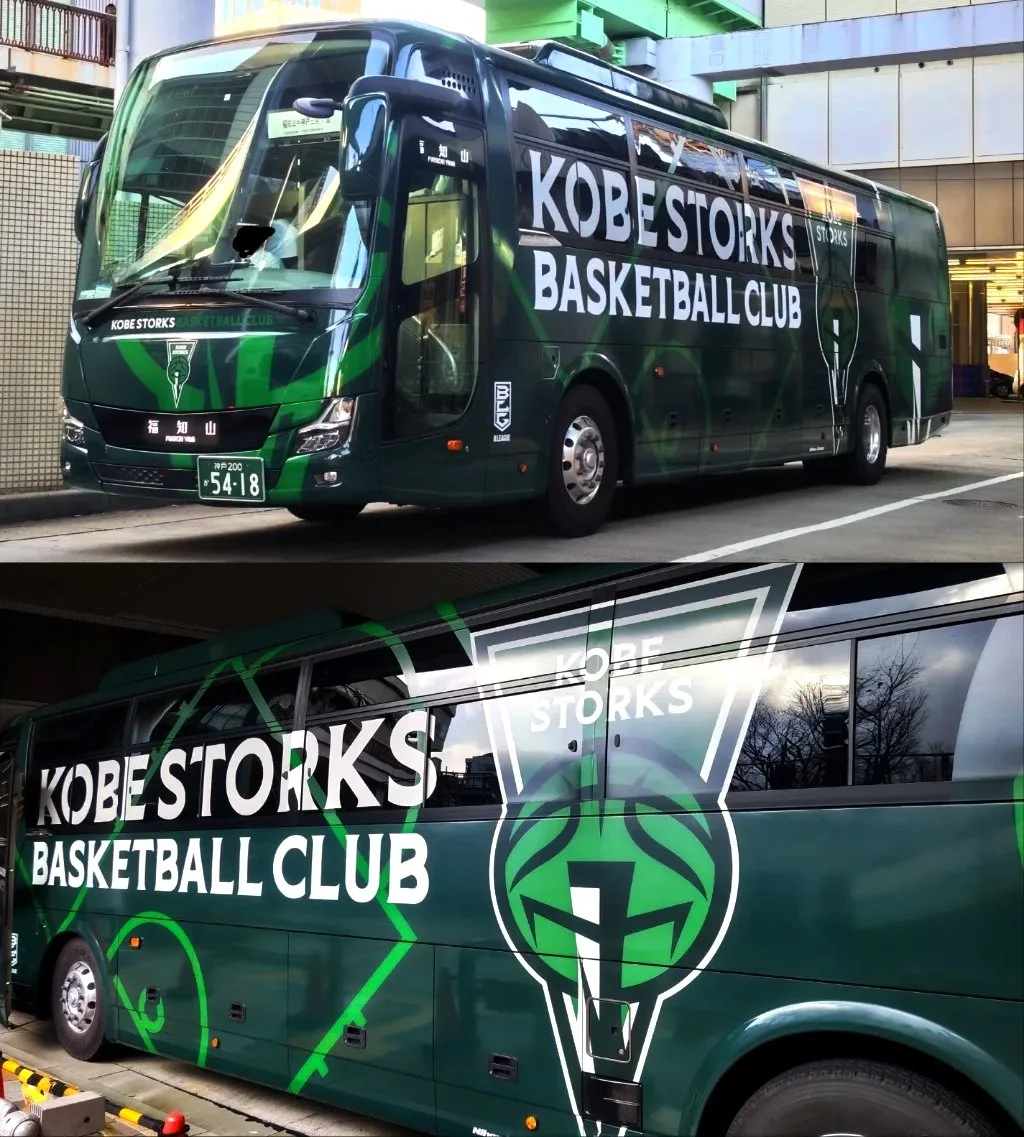
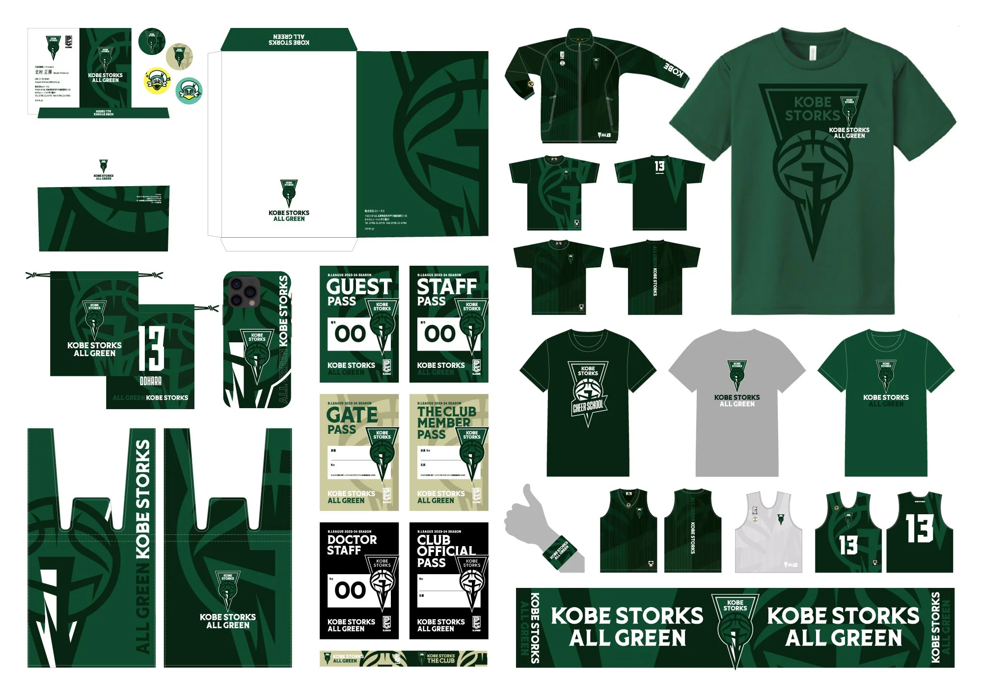
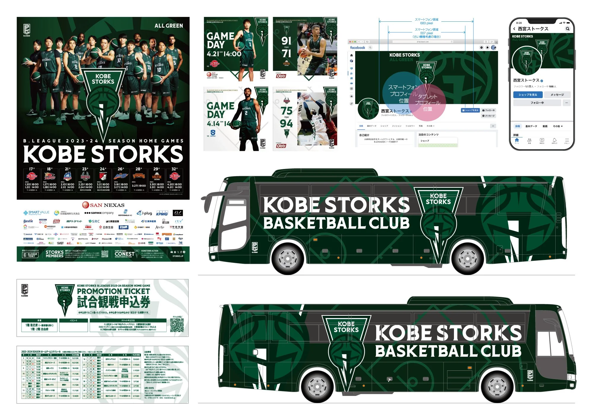
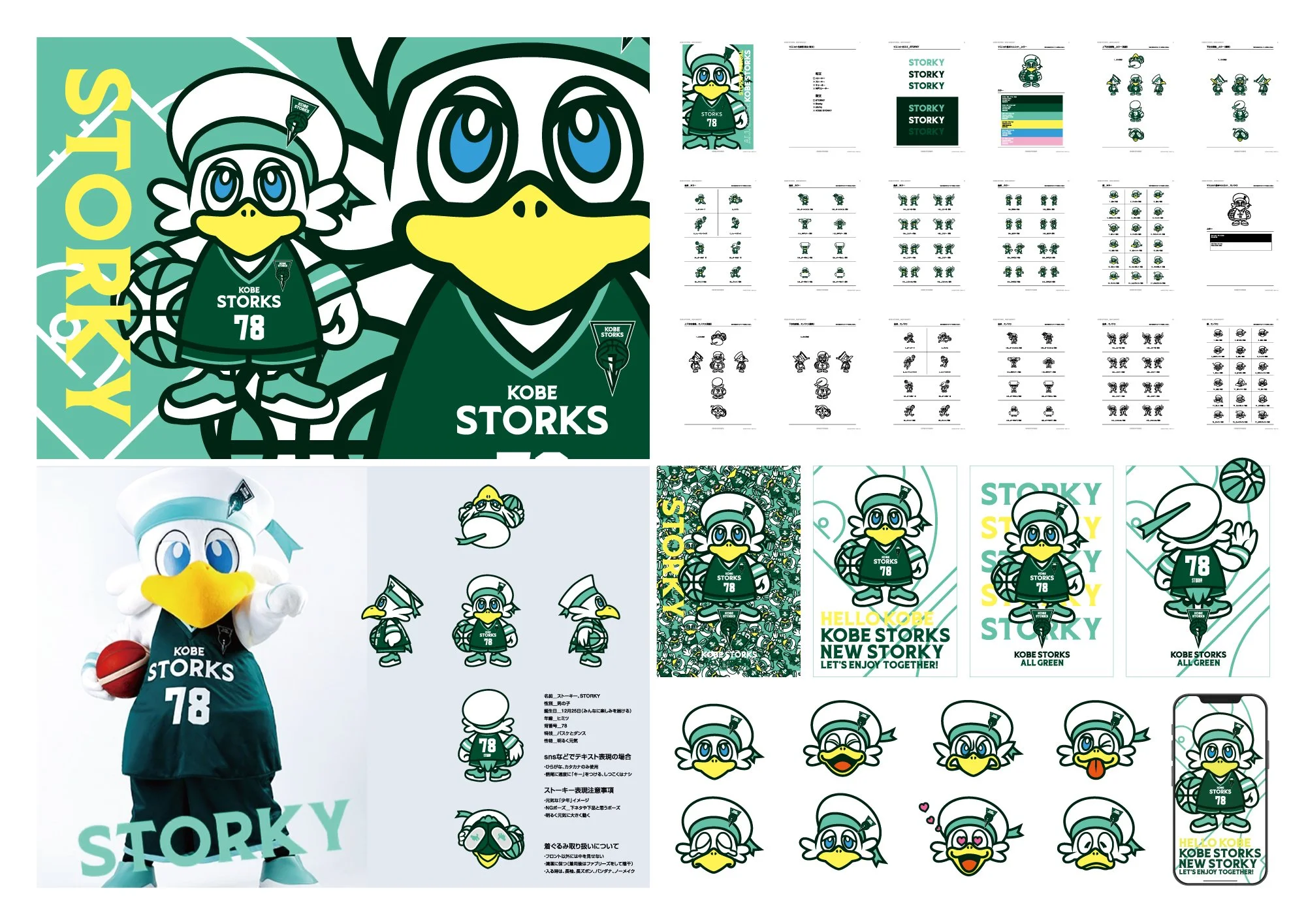
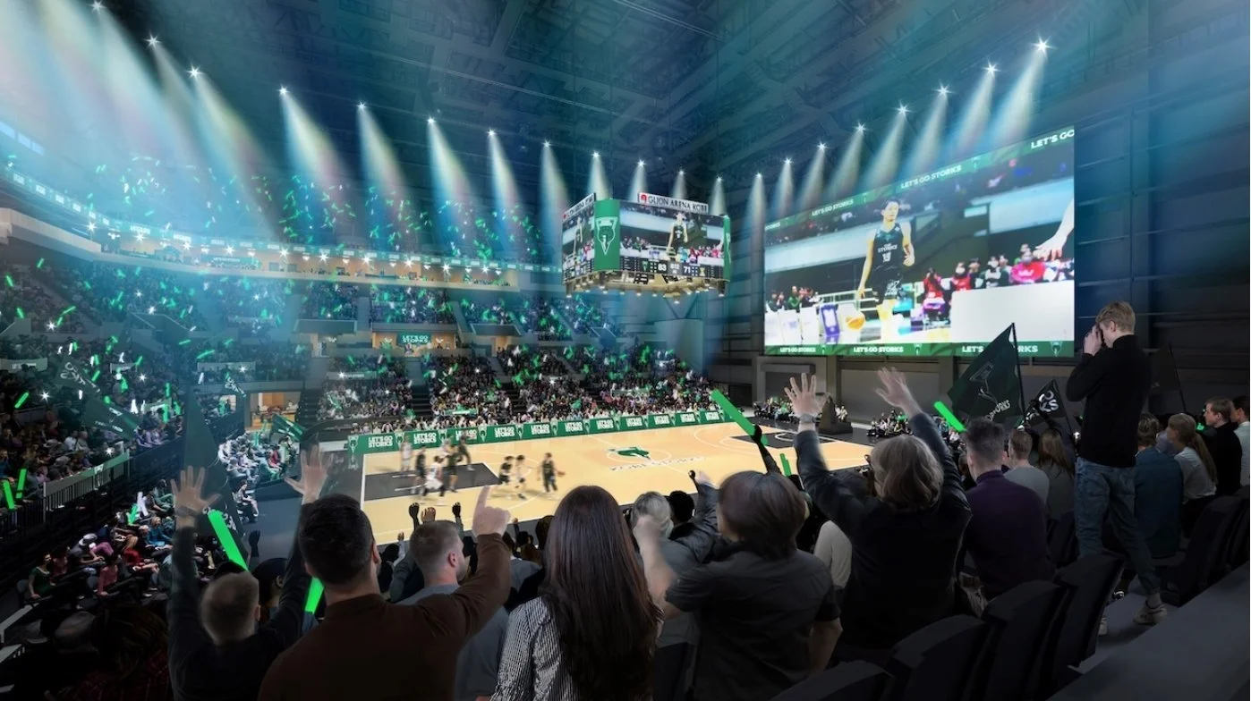
KOBE STORKS is one of the clubs in the Japan Pro Basketball League and is known for winning the domestic title. They had lost the excitement and vision to unite players and supporters and bring back glory. Our designers were tasked with reimagining KOBE STORKS as a modern, world-class club. The result is a new brand that is visually striking and expresses bold confidence. We will go to play with KOBE people and fans.
KOBE, even in Japan, has a history and an exotic atmosphere. We have recovered from the major earthquake disaster. We have created a new brand that is striking, bold and expresses confidence to move forward with KOBE.




Identity in Motion
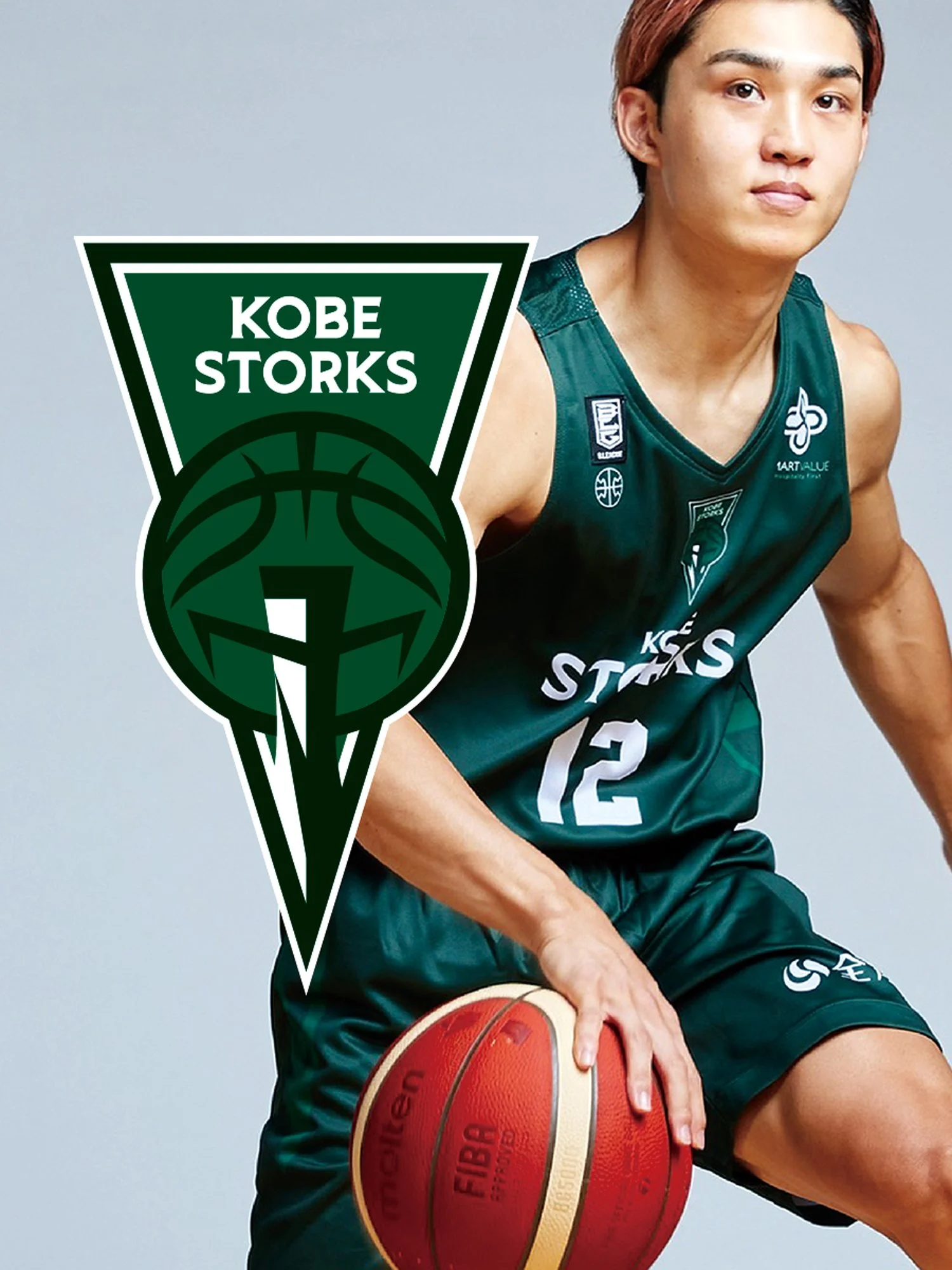
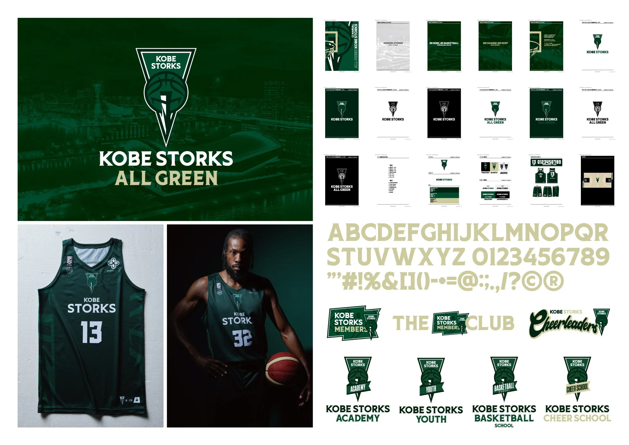
In a world saturated with visual noise, ST24 takes a different stance — one of clarity, coherence, and cultural intelligence. The new brand identity is not a static emblem but a living system, designed to communicate with precision across multiple contexts while retaining an unmistakable presence.
At the heart of the guidelines is a logo that embodies balance: bold enough to anchor, refined enough to adapt. It thrives on proportion and restraint, reflecting the project’s ambition to speak to a global audience without losing its local resonance. The accompanying palette and typography extend this language into a contemporary framework — one that is confident yet understated, international yet rooted.
What distinguishes ST24 is not just the design of a logo, but the design of a conversation. Every rule of spacing, every application across print or screen, becomes a gesture toward consistency and trust. It is a brand identity that moves with its audience, offering a platform where clarity is not compromise, but strength.
